# Exploring Swing
The previous chapter described several of the core concepts relating to Swing and showed the general form of a Swing application. This chapter continues the discussion of Swing by presenting an overview of several Swing components, such as buttons, check boxes, trees, and tables. The Swing components provide rich functionality and allow a high level of customization. Because of space limitations, it is not possible to describe all of their features and attributes. Rather, the purpose of this overview is to give you a feel for the capabilities of the Swing component set.
The Swing component classes described in this chapter are shown here:

These components are all lightweight, which means that they are all derived from JComponent.
Also discussed is the ButtonGroup class, which encapsulates a mutually exclusive set of Swing buttons, and ImageIcon, which encapsulates a graphics image. Both are defined by Swing and packaged in javax.swing.
# JLabel and ImageIcon
JLabel is Swing’s easiest-to-use component. It creates a label and was introduced in the preceding chapter. Here, we will look at JLabel a bit more closely. JLabel can be used to display text and/or an icon. It is a passive component in that it does not respond to user input. JLabel defines several constructors. Here are three of them:

Here, str and icon are the text and icon used for the label. The align argument specifies the horizontal alignment of the text and/or icon within the dimensions of the label. It must be one of the following values: LEFT, RIGHT, CENTER, LEADING, or TRAILING. These constants are defined in the SwingConstants interface, along with several others used by the Swing classes.
Notice that icons are specified by objects of type Icon, which is an interface defined by Swing. The easiest way to obtain an icon is to use the ImageIcon class. ImageIcon implements Icon and encapsulates an image. Thus, an object of type ImageIcon can be passed as an argument to the Icon parameter of JLabel’s constructor. There are several ways to provide the image, including reading it from a file or downloading it from a URL. Here is the ImageIcon constructor used by the example in this section:
ImageIcon(String filename)
It obtains the image in the file named filename.
The icon and text associated with the label can be obtained by the following methods:

The icon and text associated with a label can be set by these methods:

Here, icon and str are the icon and text, respectively. Therefore, using setText( ), it is possible to change the text inside a label during program execution.
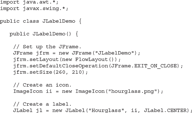
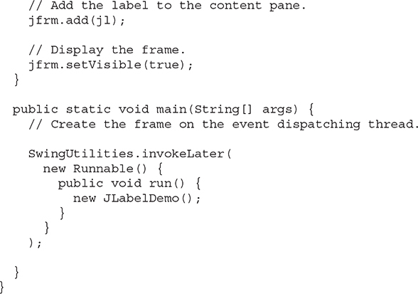
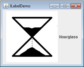
The following program illustrates how to create and display a label containing both an icon and a string. It begins by creating an ImageIcon object for the file hourglass.png, which depicts an hourglass. This is used as the second argument to the JLabel constructor. The first and last arguments for the JLabel constructor are the label text and the alignment. Finally, the label is added to the content pane.
Output from the label example is shown here:
# JTextField
JTextField is the simplest Swing text component. It is also probably its most widely used text component. JTextField allows you to edit one line of text. It is derived from JTextComponent, which provides the basic functionality common to Swing text components. JTextField uses the Document interface for its model. Three of JTextField’s constructors are shown here:

Here, str is the string to be initially presented, and cols is the number of columns in the text field. If no string is specified, the text field is initially empty. If the number of columns is not specified, the text field is sized to fit the specified string.
JTextField generates events in response to user interaction. For example, an ActionEvent is fired when the user presses ENTER. A CaretEvent is fired each time the caret (i.e., the cursor) changes position. (CaretEvent is packaged in javax.swing.event.) Other events are also possible. In many cases, your program will not need to handle these events. Instead, you will simply obtain the string currently in the text field when it is needed. To obtain the text currently in the text field, call getText( ).
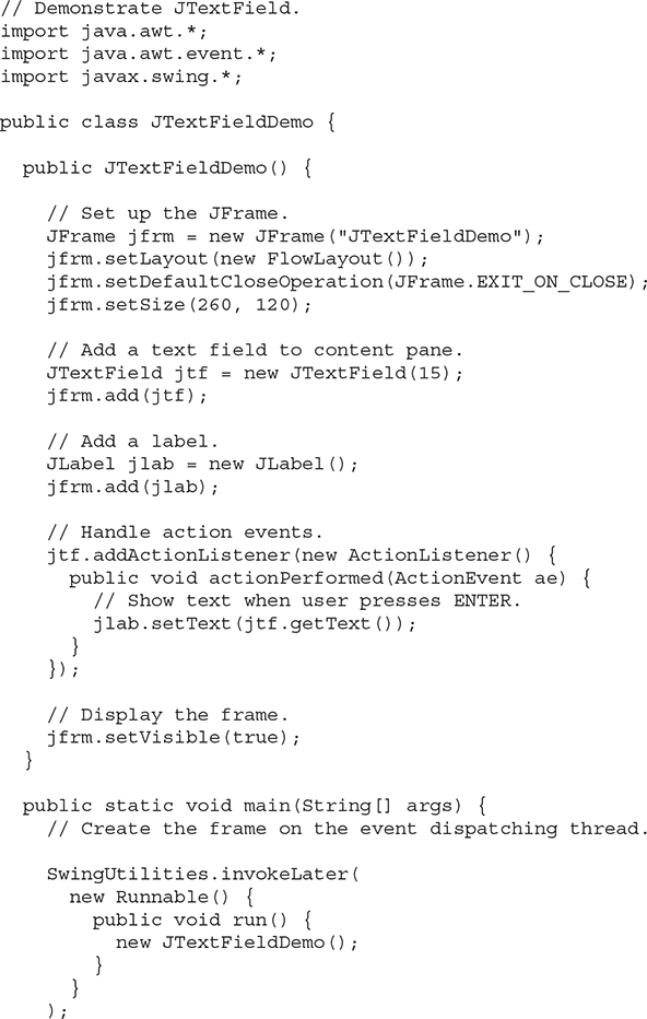
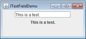
The following example illustrates JTextField. It creates a JTextField and adds it to the content pane. When the user presses ENTER, an action event is generated. This is handled by displaying the text in a label.

Output from the text field example is shown here:
# The Swing Buttons
Swing defines four types of buttons: JButton, JToggleButton, JCheckBox, and JRadioButton. All are subclasses of the AbstractButton class, which extends JComponent. Thus, all buttons share a set of common traits.
AbstractButton contains many methods that allow you to control the behavior of buttons. For example, you can define different icons that are displayed for the button when it is disabled, pressed, or selected. Another icon can be used as a rollover icon, which is displayed when the mouse is positioned over a button. The following methods set these icons:

Here, di, pi, si, and ri are the icons to be used for the indicated purpose.
The text associated with a button can be read and written via the following methods:

Here, str is the text to be associated with the button.
The model used by all buttons is defined by the ButtonModel interface. A button generates an action event when it is pressed. Other events are possible. Each of the concrete button classes is examined next.
# JButton
The JButton class provides the functionality of a push button. You have already seen a simple form of it in the preceding chapter. JButton allows an icon, a string, or both to be associated with the push button. Three of its constructors are shown here:

Here, str and icon are the string and icon used for the button.
When the button is pressed, an ActionEvent is generated. Using the ActionEvent object passed to the actionPerformed( ) method of the registered ActionListener, you can obtain the action command string associated with the button. By default, this is the string displayed inside the button. However, you can set the action command by calling setActionCommand( ) on the button. You can obtain the action command by calling getActionCommand( ) on the event object. It is declared like this:
String getActionCommand( )
The action command identifies the button. Thus, when using two or more buttons within the same application, the action command gives you an easy way to determine which button was pressed.
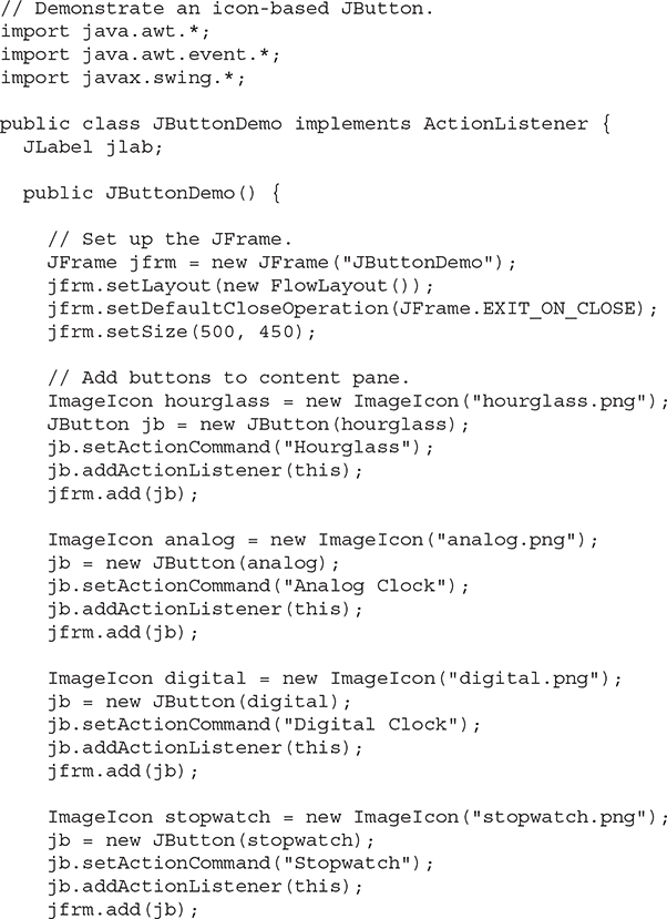
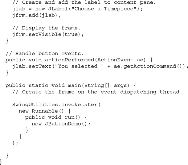
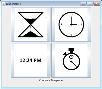
In the preceding chapter, you saw an example of a text-based button. The following demonstrates an icon-based button. It displays four push buttons and a label. Each button displays an icon that represents a timepiece. When a button is pressed, the name of that timepiece is displayed in the label.
Output from the button example is shown here:
# JToggleButton
A useful variation on the push button is called a toggle button. A toggle button looks just like a push button, but it acts differently because it has two states: pushed and released. That is, when you press a toggle button, it stays pressed rather than popping back up as a regular push button does. When you press the toggle button a second time, it releases (pops up). Therefore, each time a toggle button is pushed, it toggles between its two states.
Toggle buttons are objects of the JToggleButton class. JToggleButton implements AbstractButton. In addition to creating standard toggle buttons, JToggleButton is a superclass for two other Swing components that also represent two-state controls. These are JCheckBox and JRadioButton, which are described later in this chapter. Thus, JToggleButton defines the basic functionality of all two-state components.
JToggleButton defines several constructors. The one used by the example in this section is shown here:
JToggleButton(String str)
This creates a toggle button that contains the text passed in str. By default, the button is in the off position. Other constructors enable you to create toggle buttons that contain images, or images and text.
JToggleButton uses a model defined by a nested class called JToggleButton.Toggle-ButtonModel. Normally, you won’t need to interact directly with the model to use a standard toggle button.
Like JButton, JToggleButton generates an action event each time it is pressed. Unlike JButton, however, JToggleButton also generates an item event. This event is used by those components that support the concept of selection. When a JToggleButton is pressed in, it is selected. When it is popped out, it is deselected.
To handle item events, you must implement the ItemListener interface. Recall from Chapter 25 that each time an item event is generated, it is passed to the itemStateChanged( ) method defined by ItemListener. Inside itemStateChanged( ), the getItem( ) method can be called on the ItemEvent object to obtain a reference to the JToggleButton instance that generated the event. It is shown here:
Object getItem( )
A reference to the button is returned. You will need to cast this reference to JToggleButton.
The easiest way to determine a toggle button’s state is by calling the isSelected( ) method (inherited from AbstractButton) on the button that generated the event. It is shown here:
boolean isSelected( )
It returns true if the button is selected and false otherwise.
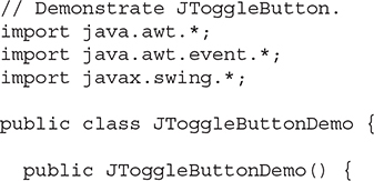
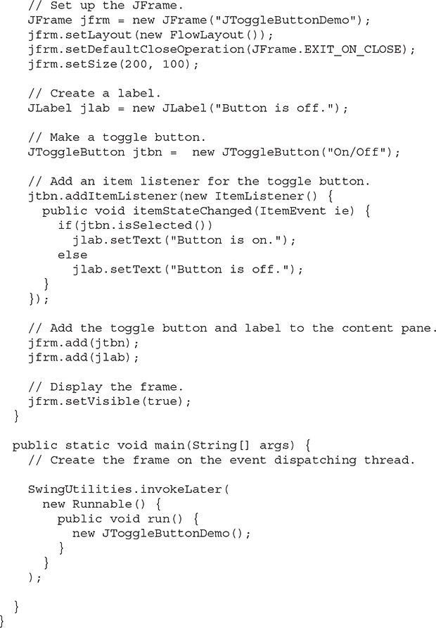
Here is an example that uses a toggle button. Notice how the item listener works. It simply calls isSelected( ) to determine the button’s state.
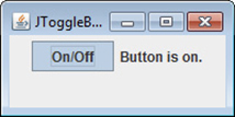
The output from the toggle button example is shown here:
# Check Boxes
The JCheckBox class provides the functionality of a check box. Its immediate superclass is JToggleButton, which provides support for two-state buttons, as just described. JCheckBox defines several constructors. The one used here is
JCheckBox(String str)
It creates a check box that has the text specified by str as a label. Other constructors let you specify the initial selection state of the button and specify an icon.
When the user selects or deselects a check box, an ItemEvent is generated. You can obtain a reference to the JCheckBox that generated the event by calling getItem( ) on the ItemEvent passed to the itemStateChanged( ) method defined by ItemListener. The easiest way to determine the selected state of a check box is to call isSelected( ) on the JCheckBox instance.
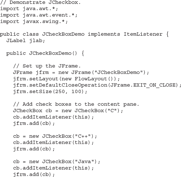
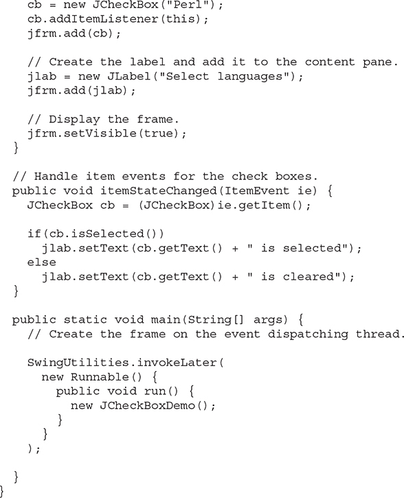
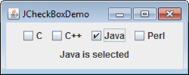
The following example illustrates check boxes. It displays four check boxes and a label. When the user clicks a check box, an ItemEvent is generated. Inside the itemStateChanged( ) method, getItem( ) is called to obtain a reference to the JCheckBox object that generated the event. Next, a call to isSelected( ) determines if the box was selected or cleared. The getText( ) method gets the text for that check box and uses it to set the text inside the label.
Output from this example is shown here:
# Radio Buttons
Radio buttons are a group of mutually exclusive buttons, in which only one button can be selected at any one time. They are supported by the JRadioButton class, which extends JToggleButton. JRadioButton provides several constructors. The one used in the example is shown here:
JRadioButton(String str)
Here, str is the label for the button. Other constructors let you specify the initial selection state of the button and specify an icon.
In order for their mutually exclusive nature to be activated, radio buttons must be configured into a group. Only one of the buttons in the group can be selected at any time. For example, if a user presses a radio button that is in a group, any previously selected button in that group is automatically deselected. A button group is created by the ButtonGroup class. Its default constructor is invoked for this purpose. Elements are then added to the button group via the following method:
void add(AbstractButton ab)
Here, ab is a reference to the button to be added to the group.
A JRadioButton generates action events, item events, and change events each time the button selection changes. Most often, it is the action event that is handled, which means that you will normally implement the ActionListener interface. Recall that the only method defined by ActionListener is actionPerformed( ). Inside this method, you can use a number of different ways to determine which button was selected. First, you can check its action command by calling getActionCommand( ). By default, the action command is the same as the button label, but you can set the action command to something else by calling setActionCommand( ) on the radio button. Second, you can call getSource( ) on the ActionEvent object and check that reference against the buttons. Third, you can check each radio button to find out which one is currently selected by calling isSelected( ) on each button. Finally, each button could use its own action event handler implemented as either an anonymous inner class or a lambda expression. Remember, each time an action event occurs, it means that the button being selected has changed and that one and only one button will be selected.
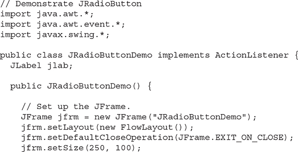
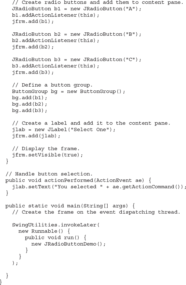
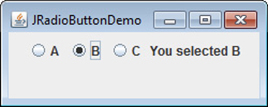
The following example illustrates how to use radio buttons. Three radio buttons are created. The buttons are then added to a button group. As explained, this is necessary to cause their mutually exclusive behavior. Pressing a radio button generates an action event, which is handled by actionPerformed( ). Within that handler, the getActionCommand( ) method gets the text that is associated with the radio button and uses it to set the text within a label.
Output from the radio button example is shown here:
# JTabbedPane
JTabbedPane encapsulates a tabbed pane. It manages a set of components by linking them with tabs. Selecting a tab causes the component associated with that tab to come to the forefront. Tabbed panes are very common in the modern GUI, and you have no doubt used them many times. Given the complex nature of a tabbed pane, they are surprisingly easy to create and use.
JTabbedPane defines three constructors. We will use its default constructor, which creates an empty control with the tabs positioned across the top of the pane. The other two constructors let you specify the location of the tabs, which can be along any of the four sides. JTabbedPane uses the SingleSelectionModel model.
Tabs are added by calling addTab( ). Here is one of its forms:
void addTab(String name, Component comp)
Here, name is the name for the tab, and comp is the component that should be added to the tab. Often, the component added to a tab is a JPanel that contains a group of related components. This technique allows a tab to hold a set of components.
The general procedure to use a tabbed pane is outlined here:
Create an instance of JTabbedPane.
Add each tab by calling addTab( ).
Add the tabbed pane to the content pane.
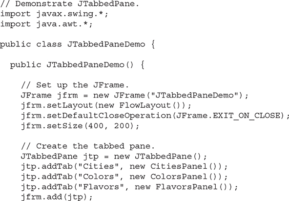
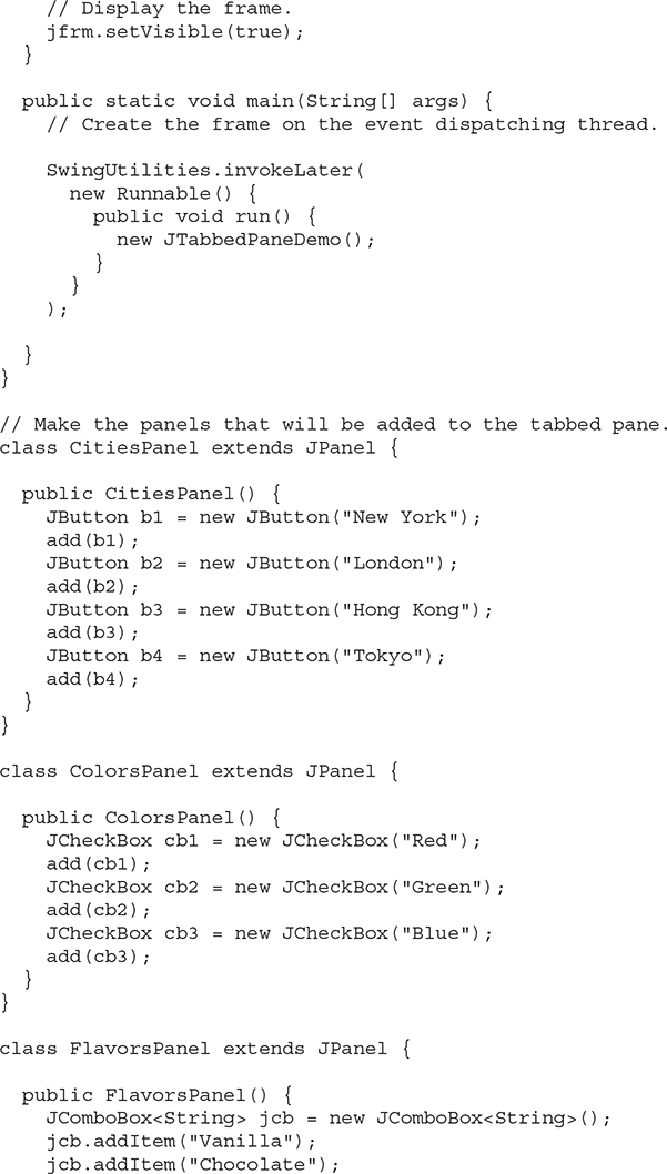
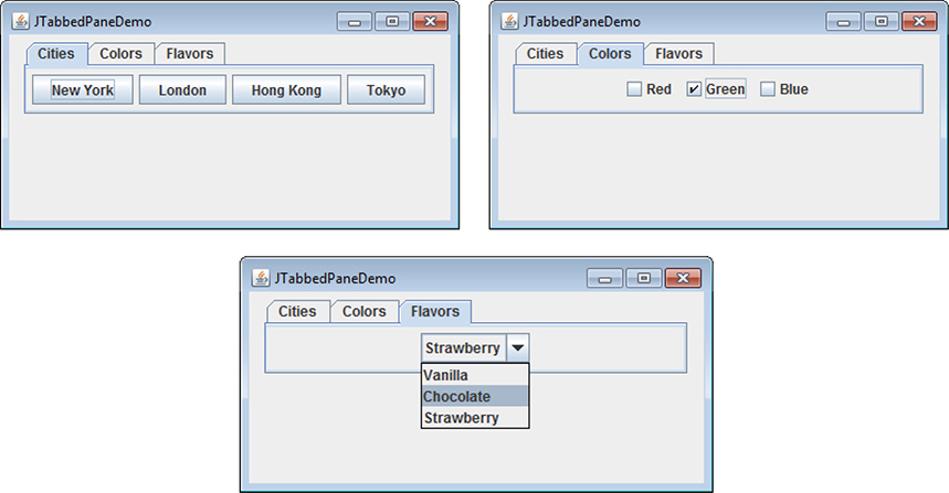
The following example illustrates a tabbed pane. The first tab is titled "Cities" and contains four buttons. Each button displays the name of a city. The second tab is titled "Colors" and contains three check boxes. Each check box displays the name of a color. The third tab is titled "Flavors" and contains one combo box. This enables the user to select one of three flavors.

Output from the tabbed pane example is shown in the following three illustrations:
# JScrollPane
JScrollPane is a lightweight container that automatically handles the scrolling of another component. The component being scrolled can be either an individual component, such as a table, or a group of components contained within another lightweight container, such as a JPanel. In either case, if the object being scrolled is larger than the viewable area, horizontal and/or vertical scroll bars are automatically provided, and the component can be scrolled through the pane. Because JScrollPane automates scrolling, it usually eliminates the need to manage individual scroll bars.
The viewable area of a scroll pane is called the viewport. It is a window in which the component being scrolled is displayed. Thus, the viewport displays the visible portion of the component being scrolled. The scroll bars scroll the component through the viewport. In its default behavior, a JScrollPane will dynamically add or remove a scroll bar as needed. For example, if the component is taller than the viewport, a vertical scroll bar is added. If the component will completely fit within the viewport, the scroll bars are removed.
JScrollPane defines several constructors. The one used in this chapter is shown here:
JScrollPane(Component comp)
The component to be scrolled is specified by comp. Scroll bars are automatically displayed when the content of the pane exceeds the dimensions of the viewport.
Here are the steps to follow to use a scroll pane:
Create the component to be scrolled.
Create an instance of JScrollPane, passing to it the object to scroll.
Add the scroll pane to the content pane.
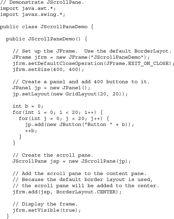
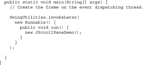
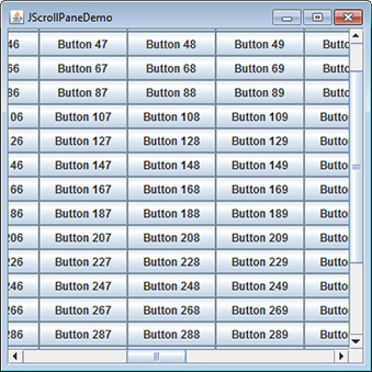
The following example illustrates a scroll pane. First, a JPanel object is created, and 400 buttons are added to it, arranged into 20 columns. This panel is then added to a scroll pane, and the scroll pane is added to the content pane. Because the panel is larger than the viewport, vertical and horizontal scroll bars appear automatically. You can use the scroll bars to scroll the buttons into view.
Output from the scroll pane example is shown here:
# JList
In Swing, the basic list class is called JList. It supports the selection of one or more items from a list. Although the list often consists of strings, it is possible to create a list of just about any object that can be displayed. JList is so widely used in Java that it is highly unlikely that you have not seen one before.
In the past, the items in a JList were represented as Object references. However, beginning with JDK 7, JList was made generic and is now declared like this:
class JList<E>
Here, E represents the type of the items in the list.
JList provides several constructors. The one used here is
JList(E[ ] items)
This creates a JList that contains the items in the array specified by items.
JList is based on two models. The first is ListModel. This interface defines how access to the list data is achieved. The second model is the ListSelectionModel interface, which defines methods that determine what list item or items are selected.
Although a JList will work properly by itself, most of the time you will wrap a JList inside a JScrollPane. This way, long lists will automatically be scrollable, which simplifies GUI design. It also makes it easy to change the number of entries in a list without having to change the size of the JList component.
A JList generates a ListSelectionEvent when the user makes or changes a selection. This event is also generated when the user deselects an item. It is handled by implementing ListSelectionListener. This listener specifies only one method, called valueChanged( ), which is shown here:
void valueChanged(ListSelectionEvent le)
Here, le is a reference to the event. Although ListSelectionEvent does provide some methods of its own, normally you will interrogate the JList object itself to determine what has occurred. Both ListSelectionEvent and ListSelectionListener are packaged in javax.swing.event.
By default, a JList allows the user to select multiple ranges of items within the list, but you can change this behavior by calling setSelectionMode( ), which is defined by JList. It is shown here:
void setSelectionMode(int mode)
Here, mode specifies the selection mode. It must be one of these values defined by ListSelectionModel:

The default, multiple-interval selection lets the user select multiple ranges of items within a list. With single-interval selection, the user can select one range of items. With single selection, the user can select only a single item. Of course, a single item can be selected in the other two modes, too. It’s just that they also allow a range to be selected.
You can obtain the index of the first item selected, which will also be the index of the only selected item when using single-selection mode, by calling getSelectedIndex( ), shown here:
int getSelectedIndex( )
Indexing begins at zero. So, if the first item is selected, this method will return 0. If no item is selected, –1 is returned.
Instead of obtaining the index of a selection, you can obtain the value associated with the selection by calling getSelectedValue( ):
E getSelectedValue( )
It returns a reference to the first selected value. If no value has been selected, it returns null.
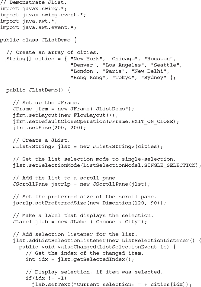
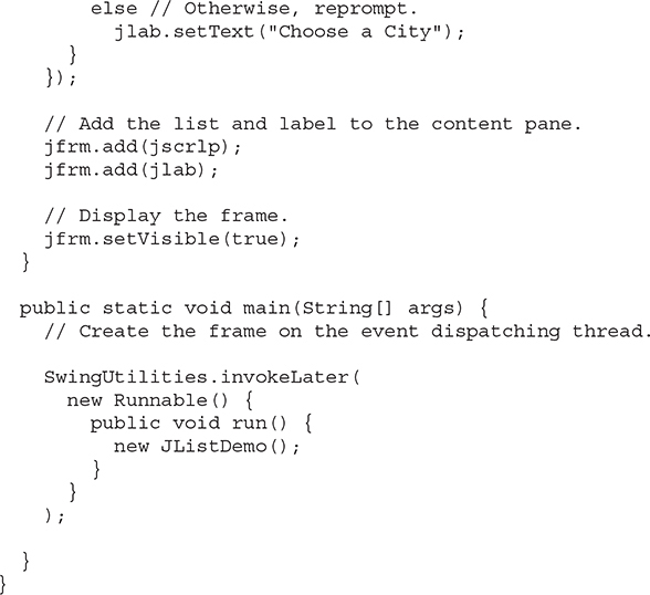
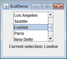
The following program demonstrates a simple JList, which holds a list of cities. Each time a city is selected in the list, a ListSelectionEvent is generated, which is handled by the valueChanged( ) method defined by ListSelectionListener. It responds by obtaining the index of the selected item and displaying the name of the selected city in a label.
Output from the list example is shown here:
# JComboBox
Swing provides a combo box (a combination of a text field and a drop-down list) through the JComboBox class. A combo box normally displays one entry, but it will also display a drop-down list that allows a user to select a different entry. You can also create a combo box that lets the user enter a selection into the text field.
In the past, the items in a JComboBox were represented as Object references. However, beginning with JDK 7, JComboBox was made generic and is now declared like this:
class JComboBox<E>
Here, E represents the type of the items in the combo box.
The JComboBox constructor used by the example is shown here:
JComboBox(E[ ] items)
Here, items is an array that initializes the combo box. Other constructors are available.
JComboBox uses the ComboBoxModel. Mutable combo boxes (those whose entries can be changed) use the MutableComboBoxModel.
In addition to passing an array of items to be displayed in the drop-down list, items can be dynamically added to the list of choices via the addItem( ) method, shown here:
void addItem(E obj)
Here, obj is the object to be added to the combo box. This method must be used only with mutable combo boxes.
JComboBox generates an action event when the user selects an item from the list. JComboBox also generates an item event when the state of selection changes, which occurs when an item is selected or deselected. Thus, changing a selection means that two item events will occur: one for the deselected item and another for the selected item. Often, it is sufficient to simply listen for action events, but both event types are available for your use.
One way to obtain the item selected in the list is to call getSelectedItem( ) on the combo box. It is shown here:
Object getSelectedItem( )
You will need to cast the returned value into the type of object stored in the list.
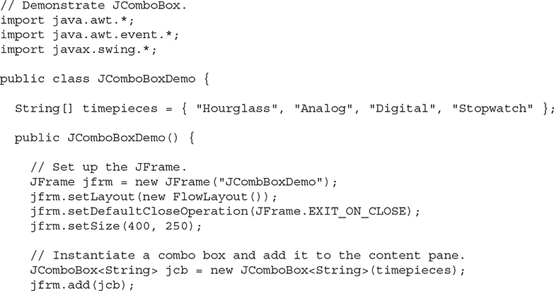
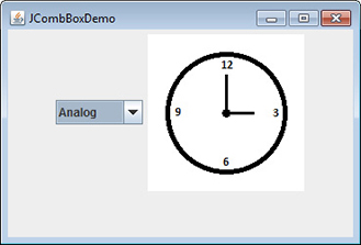
The following example demonstrates the combo box. The combo box contains entries for "Hourglass", "Analog", "Digital", and "Stopwatch". When a timepiece is selected, an icon-based label is updated to display it. You can see how little code is required to use this powerful component.
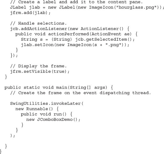
Output from the combo box example is shown here:
# Trees
A tree is a component that presents a hierarchical view of data. The user has the ability to expand or collapse individual subtrees in this display. Trees are implemented in Swing by the JTree class. A sampling of its constructors is shown here:

In the first form, the tree is constructed from the elements in the array obj. The second form constructs the tree from the elements of vector v. In the third form, the tree whose root node is specified by tn specifies the tree.
Although JTree is packaged in javax.swing, its support classes and interfaces are packaged in javax.swing.tree. This is because the number of classes and interfaces needed to support JTree is quite large.
JTree relies on two models: TreeModel and TreeSelectionModel. A JTree generates a variety of events, but three relate specifically to trees: TreeExpansionEvent, TreeSelectionEvent, and TreeModelEvent. TreeExpansionEvent events occur when a node is expanded or collapsed. A TreeSelectionEvent is generated when the user selects or deselects a node within the tree. A TreeModelEvent is fired when the data or structure of the tree changes. The listeners for these events are TreeExpansionListener, TreeSelectionListener, and TreeModelListener, respectively. The tree event classes and listener interfaces are packaged in javax.swing.event.
The event handled by the sample program shown in this section is TreeSelectionEvent. To listen for this event, implement TreeSelectionListener. It defines only one method, called valueChanged( ), which receives the TreeSelectionEvent object. You can obtain the path to the selected object by calling getPath( ), shown here, on the event object:
TreePath getPath( )
It returns a TreePath object that describes the path to the changed node. The TreePath class encapsulates information about a path to a particular node in a tree. It provides several constructors and methods. In this book, only the toString( ) method is used. It returns a string that describes the path.
The TreeNode interface declares methods that obtain information about a tree node. For example, it is possible to obtain a reference to the parent node or an enumeration of the child nodes. The MutableTreeNode interface extends TreeNode. It declares methods that can insert and remove child nodes or change the parent node.
The DefaultMutableTreeNode class implements the MutableTreeNode interface. It represents a node in a tree. One of its constructors is shown here:
DefaultMutableTreeNode(Object obj)
Here, obj is the object to be enclosed in this tree node. The new tree node doesn’t have a parent or children.
To create a hierarchy of tree nodes, the add( ) method of DefaultMutableTreeNode can be used. Its signature is shown here:
void add(MutableTreeNode child)
Here, child is a mutable tree node that is to be added as a child to the current node.
JTree does not provide any scrolling capabilities of its own. Instead, a JTree is typically placed within a JScrollPane. This way, a large tree can be scrolled through a smaller viewport.
Here are the steps to follow to use a tree:
Create an instance of JTree.
Create a JScrollPane and specify the tree as the object to be scrolled.
Add the scroll pane to the content pane.
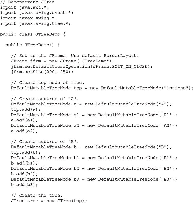
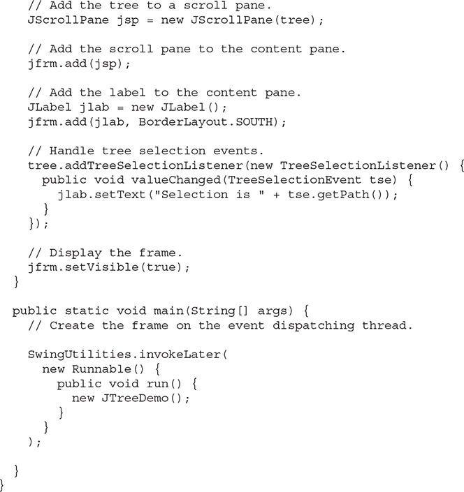
The following example illustrates how to create a tree and handle selections. The program creates a DefaultMutableTreeNode instance labeled "Options". This is the top node of the tree hierarchy. Additional tree nodes are then created, and the add( ) method is called to connect these nodes to the tree. A reference to the top node in the tree is provided as the argument to the JTree constructor. The tree is then provided as the argument to the JScrollPane constructor. This scroll pane is then added to the content pane. Next, a label is created and added to the content pane. The tree selection is displayed in this label. To receive selection events from the tree, a TreeSelectionListener is registered for the tree. Inside the valueChanged( ) method, the path to the current selection is obtained and displayed.
Output from the tree example is shown here:
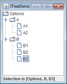
The string presented in the text field describes the path from the top tree node to the selected node.
# JTable
JTable is a component that displays rows and columns of data. You can drag the cursor on column boundaries to resize columns. You can also drag a column to a new position. Depending on its configuration, it is also possible to select a row, column, or cell within the table, and to change the data within a cell. JTable is a sophisticated component that offers many more options and features than can be discussed here. (It is perhaps Swing’s most complicated component.) However, in its default configuration, JTable still offers substantial functionality that is easy to use—especially if you simply want to use the table to present data in a tabular format. The brief overview presented here will give you a general understanding of this powerful component.
Like JTree, JTable has many classes and interfaces associated with it. These are packaged in javax.swing.table.
At its core, JTable is conceptually simple. It is a component that consists of one or more columns of information. At the top of each column is a heading. In addition to describing the data in a column, the heading also provides the mechanism by which the user can change the size of a column or change the location of a column within the table. JTable does not provide any scrolling capabilities of its own. Instead, you will normally wrap a JTable inside a JScrollPane.
JTable supplies several constructors. The one used here is
JTable(Object[ ][ ] data, Object[ ] colHeads)
Here, data is a two-dimensional array of the information to be presented, and colHeads is a one-dimensional array with the column headings.
JTable relies on three models. The first is the table model, which is defined by the TableModel interface. This model defines those things related to displaying data in a two-dimensional format. The second is the table column model, which is represented by TableColumnModel. JTable is defined in terms of columns, and it is TableColumnModel that specifies the characteristics of a column. These two models are packaged in javax.swing.table. The third model determines how items are selected, and it is specified by the ListSelectionModel, which was described when JList was discussed.
A JTable can generate several different events. The two most fundamental to a table’s operation are ListSelectionEvent and TableModelEvent. A ListSelectionEvent is generated when the user selects something in the table. By default, JTable allows you to select one or more complete rows, but you can change this behavior to allow one or more columns, or one or more individual cells to be selected. A TableModelEvent is fired when that table’s data changes in some way. Handling these events requires a bit more work than it does to handle the events generated by the previously described components and is beyond the scope of this book. However, if you simply want to use JTable to display data (as the following example does), then you don’t need to handle any events.
Here are the steps required to set up a simple JTable that can be used to display data:
Create an instance of JTable.
Create a JScrollPane object, specifying the table as the object to scroll.
Add the scroll pane to the content pane.
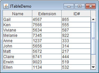
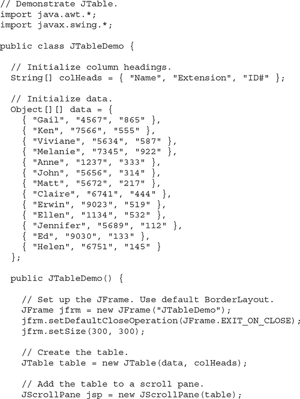
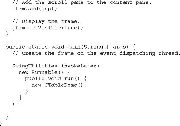
The following example illustrates how to create and use a simple table. A one-dimensional array of strings called colHeads is created for the column headings. A two-dimensional array of strings called data is created for the table cells. You can see that each element in the array is an array of three strings. These arrays are passed to the JTable constructor. The table is added to a scroll pane, and then the scroll pane is added to the content pane. The table displays the data in the data array. The default table configuration also allows the contents of a cell to be edited. Changes affect the underlying array, which is data in this case.
Output from this example is shown here:
